AT&T Compass
AT&T Compass is a web application designed to provide Field Managers with real-time insights to enhance decision-making and optimize team performance. By leveraging data-driven analytics, the platform enables managers to reduce data review time, identify technician development opportunities, and improve operational efficiency.
Problem Statement
Field Managers faced challenges in tracking key performance indicators (KPIs), monitoring engagement activities, and accessing training resources efficiently. The existing workflows required manual data collection and lacked an intuitive interface for quick decision-making.
Project Goals
- Streamline access to real-time performance insights.
- Enhance user engagement through gamification (badges, ranking, and streaks).
- Provide training resources and engagement activities to boost productivity.
- Ensure a responsive, accessible, and visually intuitive dashboard.
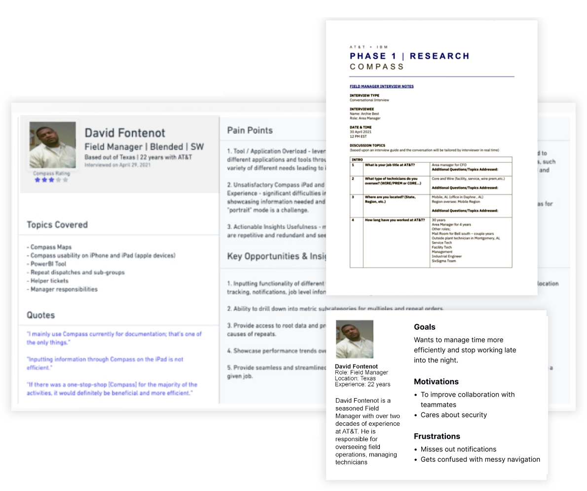
UX Research & Insights
A web platform providing Field Managers instant access to insights, streamlining data-driven decision-making.
- Conducted user research to identify key pain points in the current workflow and inform design decisions.
- Delayed decision-making due to scattered performance metrics.
- Lack of motivation & engagement among team members.
- Time-consuming manual tracking of sales and resolve rates.
- Need for a centralized dashboard with training and progress tracking.
Design Process
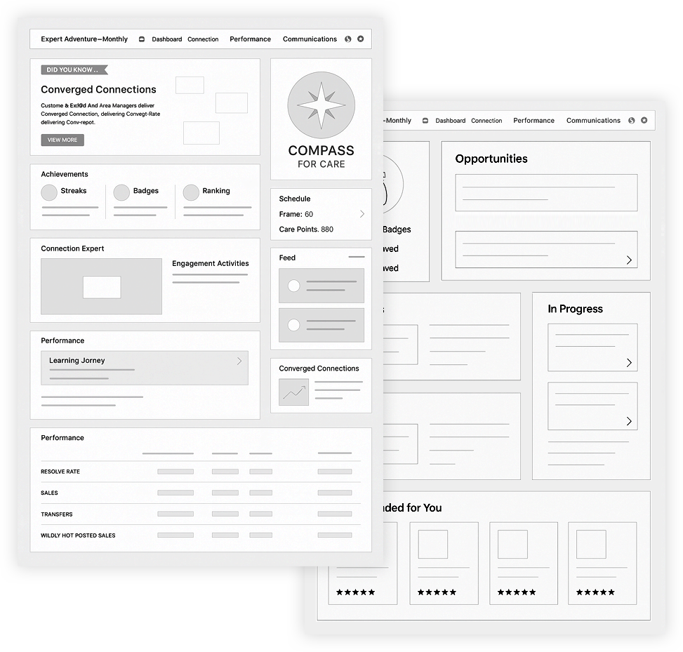
- Wireframing & Information Architecture
- Created low-fidelity wireframes focusing on data visibility and ease of navigation.
- Organized the dashboard layout to prioritize achievements, training, and performance metrics.
- Iterated on wireframes based on feedback from stakeholders and potential end-users to improve usability.
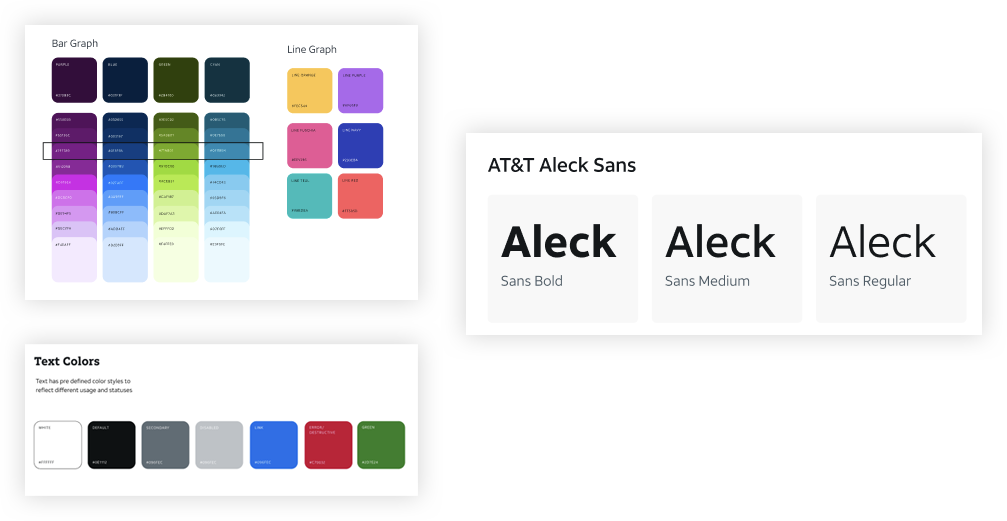
- UI Design & Visual Enhancements
- Used AT&T’s brand identity for a professional, intuitive interface.
- Designed gamification elements (badges, streaks, leaderboards) to motivate managers.
- Ensured a responsive design for tablets and mobile devices.
- Prototyping & User Testing
- Built an interactive prototype to simulate user interactions.
- Conducted usability testing with 10+ Field Managers, resulting in:
-
- 30% faster data retrieval with a streamlined dashboard.
- Higher engagement due to gamification features.
- Improved task completion rates by reducing unnecessary clicks.
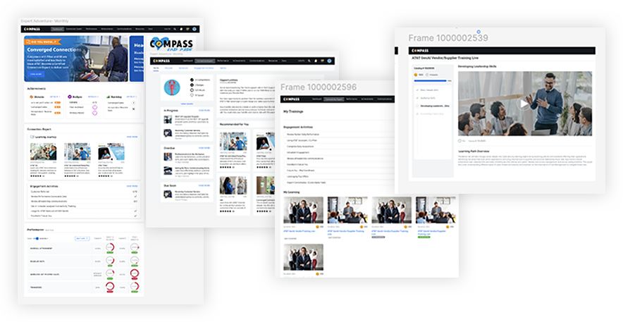
Final Solution
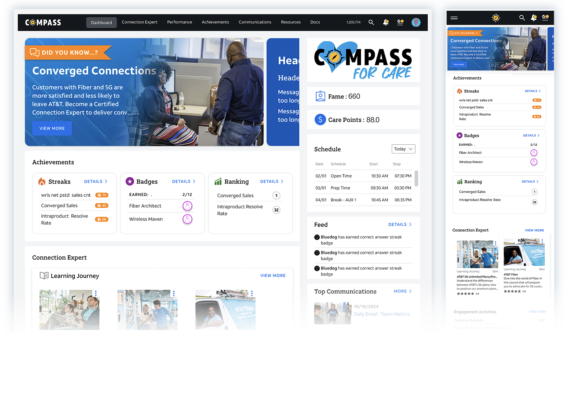
- Real-Time Performance Tracking- A visually engaging performance dashboard displaying KPIs (Resolve Rate, Sales, Transfers).
- Gamification & Achievements- Badges, ranking, and streak tracking encourage engagement and competition.
- Schedule & Task Management- A personalized schedule section keeps managers on track with daily tasks.
- Engagement Activities & Community Feed- Displays recent achievements, updates, and competitions to encourage participation.
Results & Impact
- 30% Faster KPI access
- Increased engagement by 40% due to gamification
- User satisfaction score of 4.7/5 in usability testing
- More efficient training adoption among Field Managers
Reflection & Key Learnings
- Iterative testing led to major improvements in data visualization.
- Gamification drives engagement and encourages performance tracking.
- User feedback is crucial for refining UX, especially in data-heavy dashboards.
Future Enhancements
- AI-driven insights for predictive analytics
- Enhanced mobile experience with a dedicated PWA
- More interactive microlearning modules
Conclusion
AT&T Compass transformed Field Manager workflows by providing a data-driven, intuitive, and engaging experience. By focusing on usability, engagement, and real-time analytics, the platform empowers managers to make better, faster decisions—ultimately improving overall team performance.